How to Create Nature-Level Scientific Figures on a Budget
The Landscape: Finding the Right Tool for the Job
To understand where FigureLabs fits, we need to objectively look at the current ecosystem. Each tool has its strengths, but also specific "friction points" for scientists.
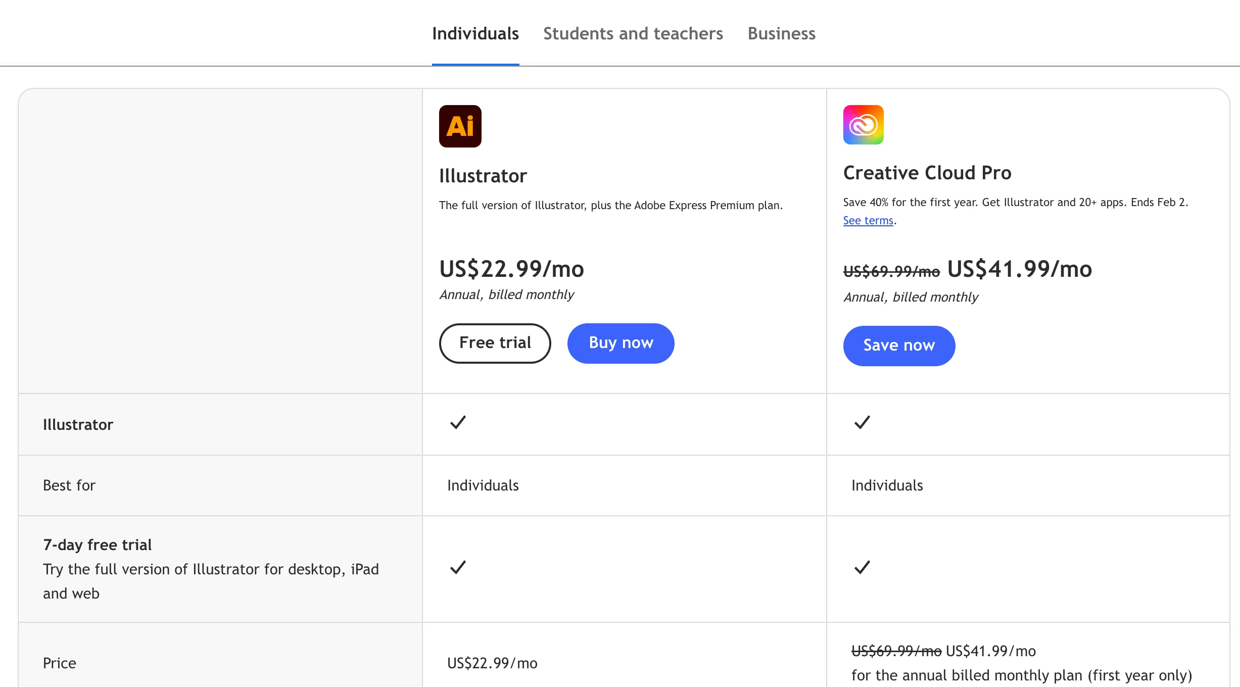
1. Adobe Illustrator: The Gold Standard (But at a Cost)
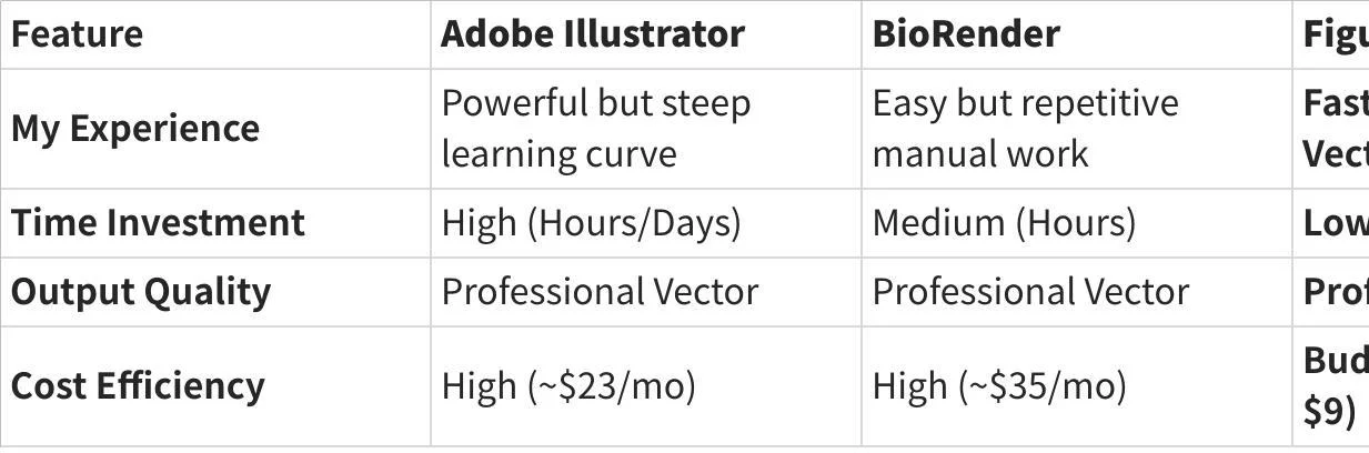
The Experience: There is no denying Adobe is the industry leader. It offers unparalleled control. However, my experience is that it is "over-engineered" for daily scientific needs.
The Friction: Starting from a blank white screen is daunting. Drawing a phospholipid bilayer from scratch using Bézier curves takes hours of practice.
Best For: Professional graphic designers or scientists who love illustration.
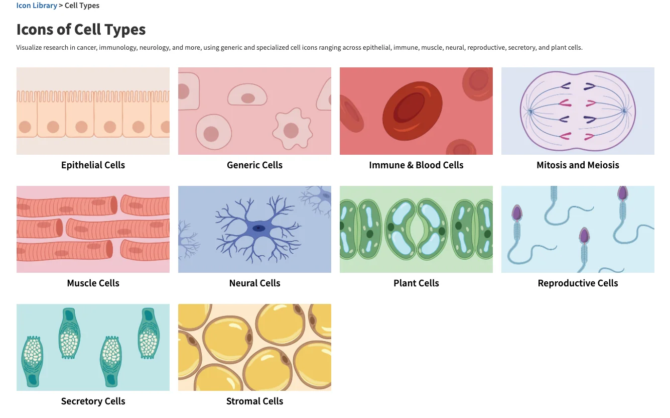
2. BioRender: The Library Giant
The Experience: BioRender revolutionized our field with its drag-and-drop library. It is intuitive and scientifically accurate.
The Friction: It is strictly manual. Building complex pathways still requires dragging hundreds of icons. Furthermore, the subscription cost (~$35/mo) can be a hurdle for students or labs between grants.
Best For: Labs with dedicated budgets who prefer manual assembly
3. General AI (Midjourney/DALL-E): The Artist
The Experience: These tools are fun and fast.
The Friction: In my testing, they consistently fail at science. They treat biology as "texture," often merging organelles or garbling text. Crucially, they lack vector export, making them unsuitable for print journals.
Best For: Slide backgrounds or blog covers, not data figures.
Why FigureLabs Caught My Attention
What makes FigureLabs different in my experience is that it doesn't try to replace the artistry of Adobe or the library of BioRender—it tries to automate the layout process while keeping the scientific rigor.
It solves the "Blank Canvas Syndrome" by using AI to generate a draft, but unlike Midjourney, it respects the need for Vector (SVG) output.
My Comparison Experience
Practical Workflow: How I Use It (Free & Budget)
I believe the best way to evaluate a tool is to try it in a real-world scenario. Here is the workflow I developed that balances cost and quality.
Phase 1: Brainstorming (The Free Tier)
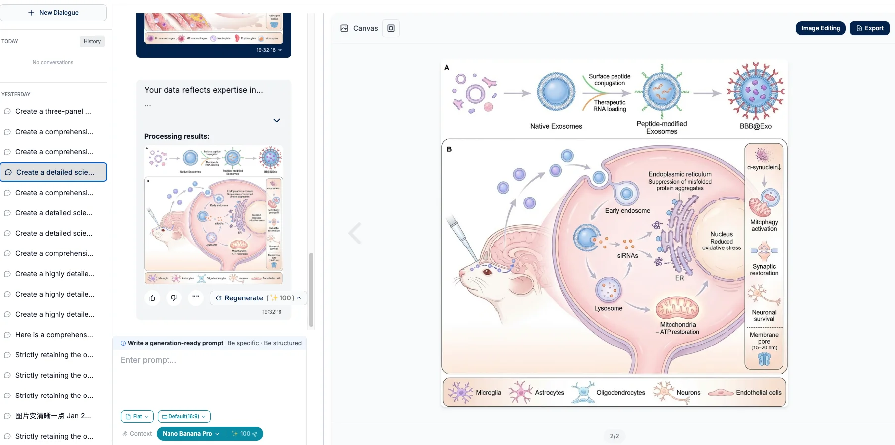
Before I commit to a subscription, I use the 3 Free Trials to visualize concepts.
My Use Case: I needed to explain a specific T-cell exhaustion pathway for a lab meeting.
Action: I typed the prompt into FigureLabs.
Result: Within seconds, I had a scientifically plausible layout. It wasn't perfect, but it saved me 2 hours of sketching.
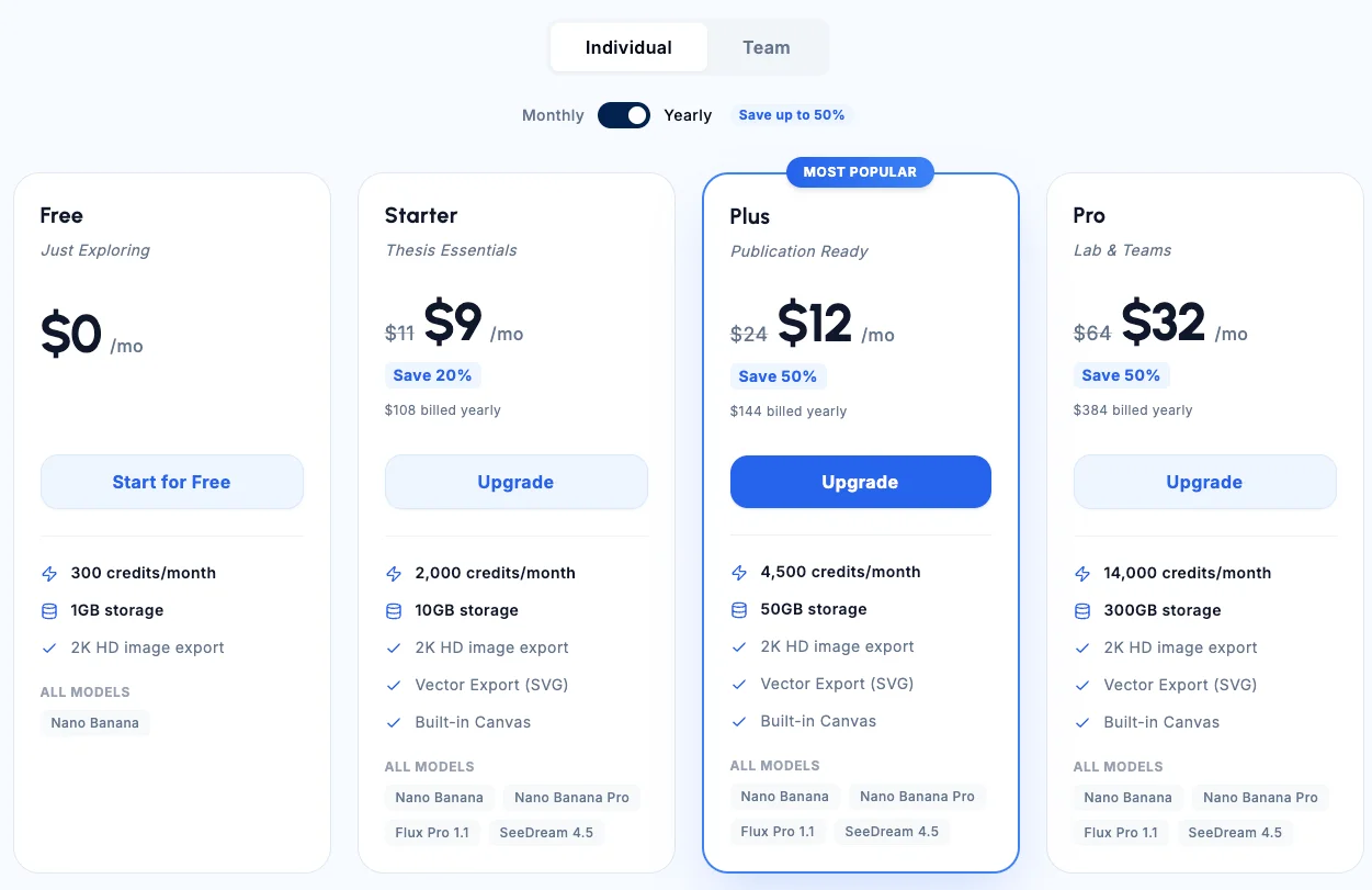
Phase 2: Publication Ready (The $9 Tier)
When it came time to submit the paper, I needed high-resolution files. This is where the Basic Plan ($9/mo) became essential.
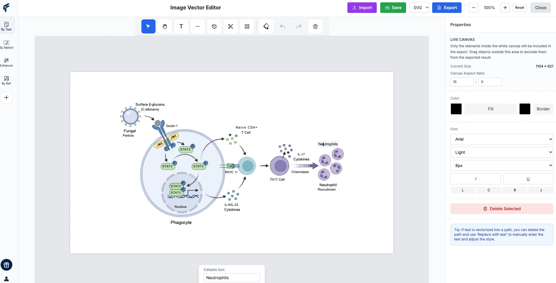
The "Aha!" Moment: The Image Vectorization feature.
The Process:
- I generated an AI image.
- I clicked "Vectorize" to convert it into an SVG.
- I opened it in the Built-in Editor.
Crucial Step: I was able to click on specific text labels that the AI had misspelled and type in the correct scientific terms. I also adjusted the color scheme to match my previous figures.
The Value: For $9, I got a result that would have taken me a full day in Adobe or BioRender.
Conclusion: A Smart Addition to Your Toolkit
Is FigureLabs a complete replacement for Adobe Illustrator? For professional designers, no. But for 90% of researchers who need high-quality figures, fast, and on a budget, it is a game-changer.
It offers a pragmatic middle ground:
- Faster than drawing from scratch.
- Cheaper than premium subscriptions.
- More accurate than general AI art tools.
If you are looking to optimize your workflow without breaking the bank, I highly recommend starting with the 3 Free Trials to see if it fits your research style.
Ready to create publication-ready figures? 👉 Try FigureLabs for Free